PRODUCT DESIGN CASE STUDY

Helix

Helix

Helix

A lab operations platform that digitises sample tracking for technicians and managers — end to end.

A lab operations platform that digitises sample tracking for technicians and managers — end to end.

A lab operations platform that digitises sample tracking for technicians and managers — end to end.

ROLE

Product Design

TIMELINE

16 Weeks

PLATFORM

Application

IMPACT

50% TAT reuction

01 · OVERVIEW

From zero to a solid workflow

From zero to a solid workflow

Context

  • Lab processes ran on only physical registers

  • TAT was monitored, but task-level gaps and delays stayed invisible. No way to pinpoint where delays occurred

My role

  • Digitising legacy lab processes

  • Understanding & standardising end-to-end processes in all labs across India through research workshops

Goal

  • Replace manual registers with digitised workflows

  • Track every sample from collection to report

  • Ensure fast adoption by technicians and managers

Constraints

  • Some points of manual intervention still exist

  • Different zones in India have different lab structures. Thus, creating one standard workflow required trial and error

02 · THE PROBLEM

The start and end were clear. Everything in between was a grey area.

The start and end were clear. Everything in between was a grey area.

The start and end were clear. Everything in between was a grey area.

  • Technicians worked off physical registers with no sample visibility

  • No clarity on task ownership or next steps

  • Delays happened silently, errors went untracked

  • Managers had no way to course-correct in real time

Design response

  • Broke the workflow into smaller, sequential steps to reduce cognitive load

  • Assigned clear ownership to every task; technician or manager

  • Built real-time status visibility so managers could spot delays without chasing people

The Design Hypothesis: If every sample has a visible owner and a tracked status, delays will surface before they become problems

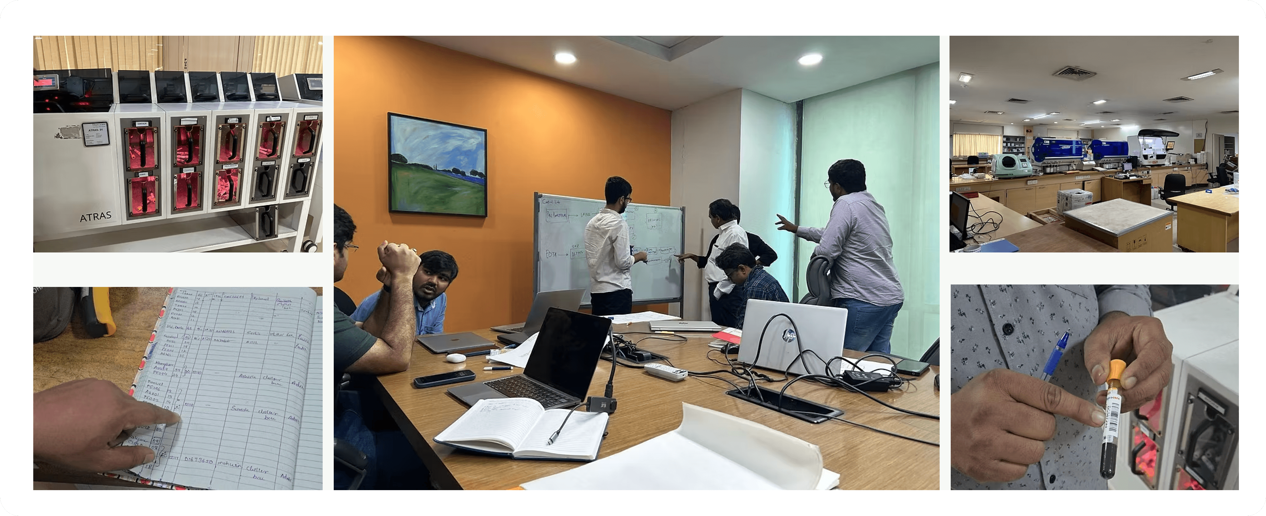
The research process

The research process

The workshop

The workshop

03 · INSIGHTS

The research insights

The research insights

1️⃣ Sample Journey:

  • The typical flow & processing time of samples are almost the same across all labs

  • The placement of the different departments varied

2️⃣ Lab-Technician Flow

  • In most labs (regional), the same user performs multiple functions. Thus, the ideal process needed to cater to their convenience to optimise turnaround time

  • This user would multi-task and interact with the device with gloves, hence, the steps needed to be designed with this in mind

3️⃣ Lab-Manager Flow:

  • The lab-manager must have complete visibility of each sample, process, lab-technician

  • This user must also have the flexibility to assign, re-assign tasks and approve, reject sample movement to the next department
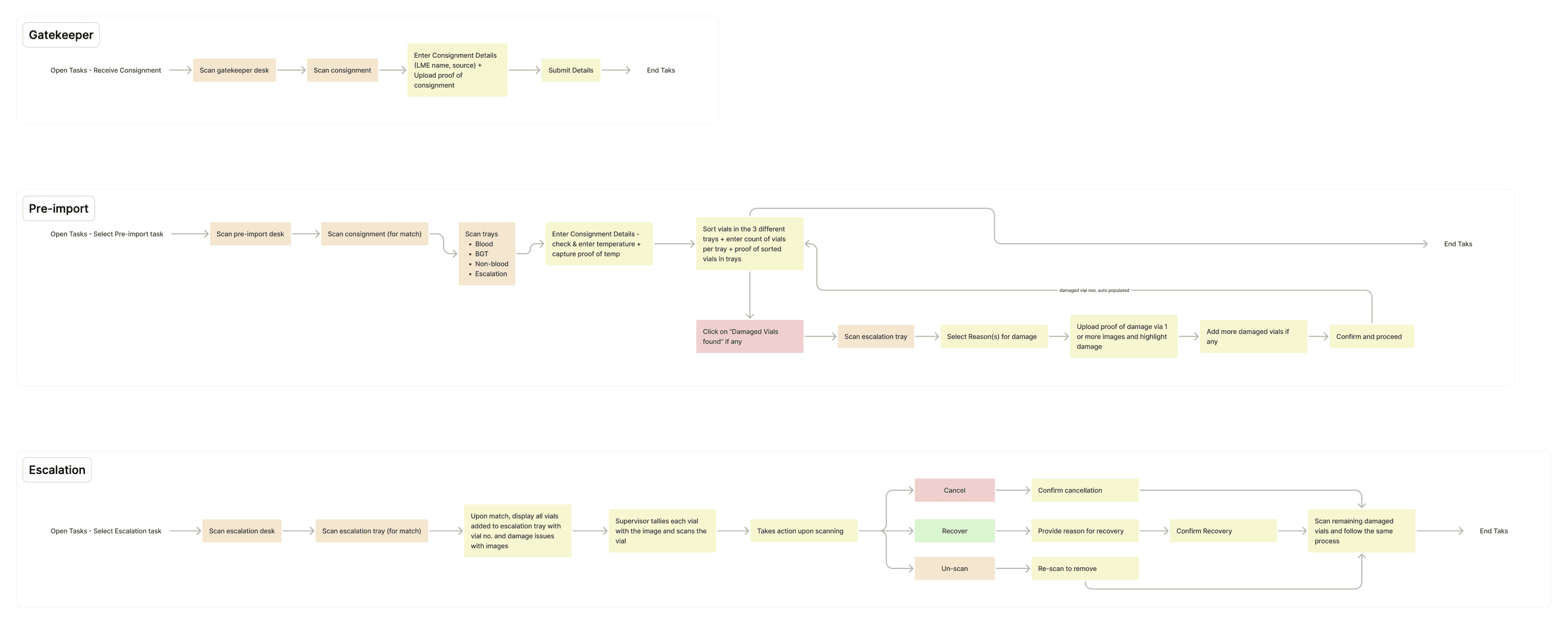
Sample IAs in different departments

Sample IAs in different departments

05 · LEARNINGS

The design decisions

The design decisions

Error minimisation on-ground

  • Maximum errors today are caused by similar on-ground components like forward sorting trays and numbering

  • This led to making changes not just on the app but also within the lab

  • The team introduced multiple trays of varying colours with prominent numbering. The trays and numbers were mapped and presented on the app making the process more efficient

Prioritising Cognitive Load Over Click Count

  • Standard UX practice favors grouping related information to minimize steps. For this user, that approach didn't hold

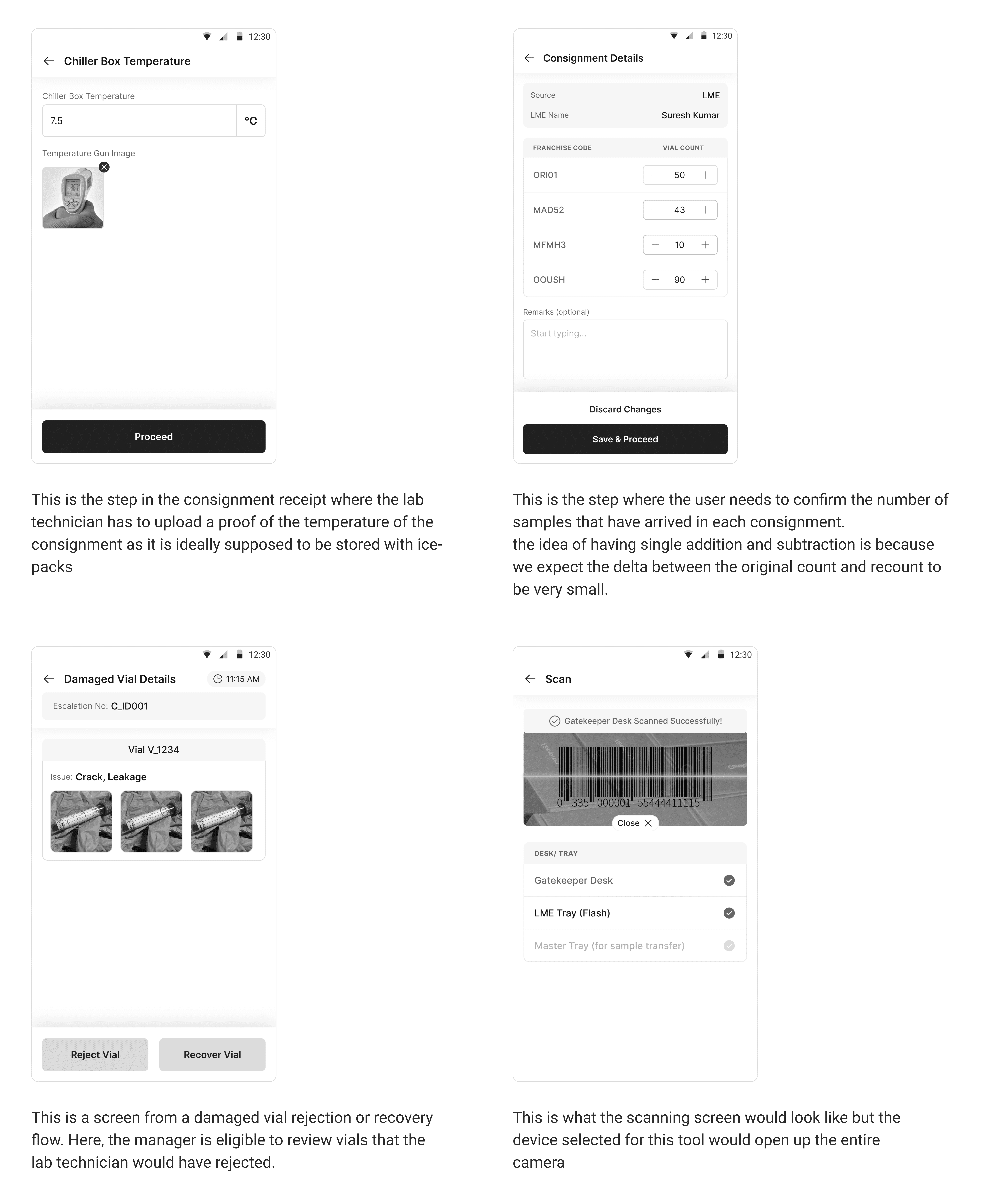
  • Given the user's working conditions — gloves that make scrolling impractical — we distributed requirements across multiple, simpler steps rather than consolidating them. Each step was designed to fit fully within a single screen, with no scrolling required. This traded a higher step count for lower cognitive load at each stage.

Making the app self-explanatory to reduce training time

  • Every step is supported with a graphic representation of what is expected and how to do it to avoid dependency

Error minimisation on-ground

  • Maximum errors today are caused by similar on-ground components like forward sorting trays and numbering

  • This led to making changes not just on the app but also within the lab

  • The team introduced multiple trays of varying colours with prominent numbering. The trays and numbers were mapped and presented on the app making the process more efficient

Prioritising Cognitive Load Over Click Count

  • Standard UX practice favors grouping related information to minimize steps. For this user, that approach didn't hold

  • Given the user's working conditions — gloves that make scrolling impractical — we distributed requirements across multiple, simpler steps rather than consolidating them. Each step was designed to fit fully within a single screen, with no scrolling required. This traded a higher step count for lower cognitive load at each stage.

Making the app self-explanatory to reduce training time

  • Every step is supported with a graphic representation of what is expected and how to do it to avoid dependency

Rough Wireframes

Rough Wireframes

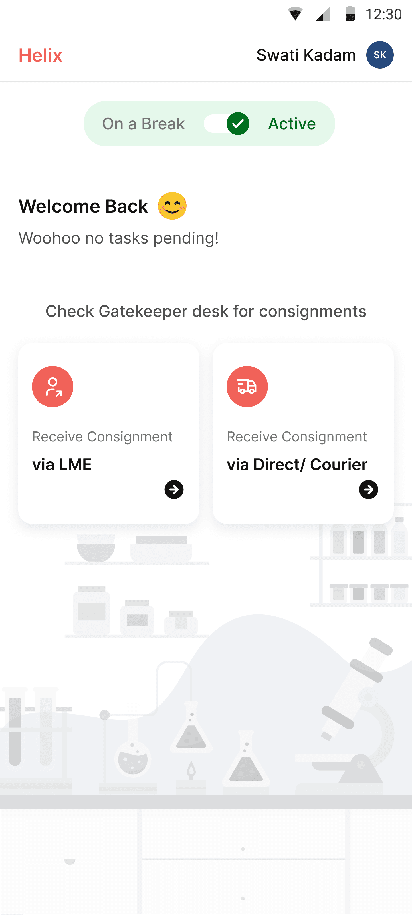
Some Key Screens with final UI

Some Key Screens with final UI

The user interacting with the tool

The user interacting with the tool

04 · IMPACT

Fewer errors, faster turnarounds, and a system built to scale.

Fewer errors, faster turnarounds, and a system built to scale.

Fewer errors, faster turnarounds, and a system built to scale.

50% (2 hrs - 1 hr)

TAT reduction per sample

23%

increase in daily sample processing

Better Monitoring

Real-time tracking, performance insights, and early issue detection.

FIN

That’s the case. Want another one?

That’s the case. Want another one?