PRODUCT DESIGN CASE STUDY
ROLE
Product Design
TIMELINE
2 Weeks
PLATFORM
Mobile + Web App
USERS/ FRANCHISES
10K+


03 · INSIGHTS
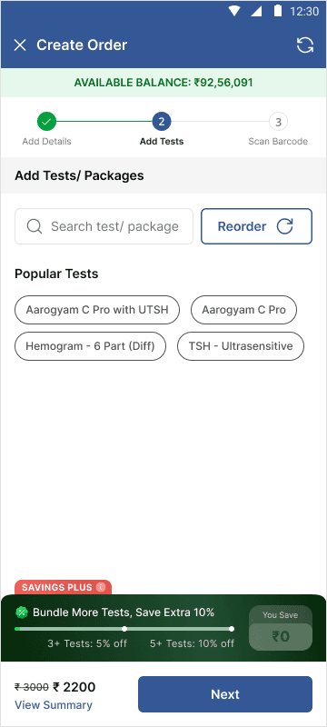
1️⃣ The Tracker:
The order placement flow already exists today. It wasn't broken, hence we didn't interfere to fix it.
We simply added a tracker within the flow with bundling tests disciunts.
2️⃣ The Add-ons:
Once the franchise staff/ admin added tests to an order and proceeded, the system would prompt relevant add-ons to help increase tests within the bundle.
3️⃣ The Re-order Action:
Every order that the franchise unlocks "Savings Plus" on, gets stored in the "Reorder" section, where an entire order can be placed with just a click.

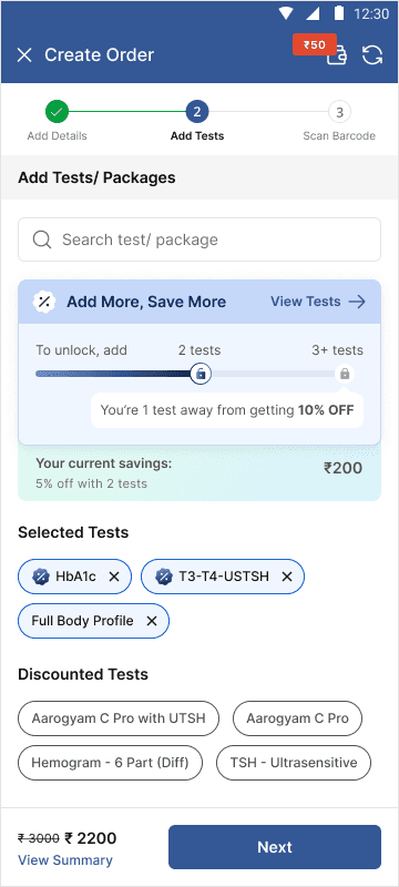


Screen 1: The order tracker occupies a disproportionate amount of screen real estate. This makes sense for users placing 1–2 orders a day, but our users place 100+ orders and are already familiar with how the tracker works — so a minimal, compact tracker would serve them better.
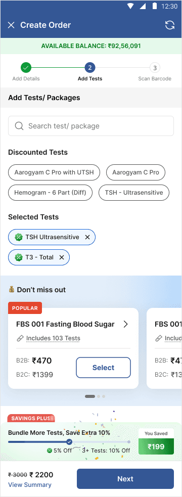
Screen 2: The add-ons section is pushed into a vertical scroll, making it easy for users to miss entirely.
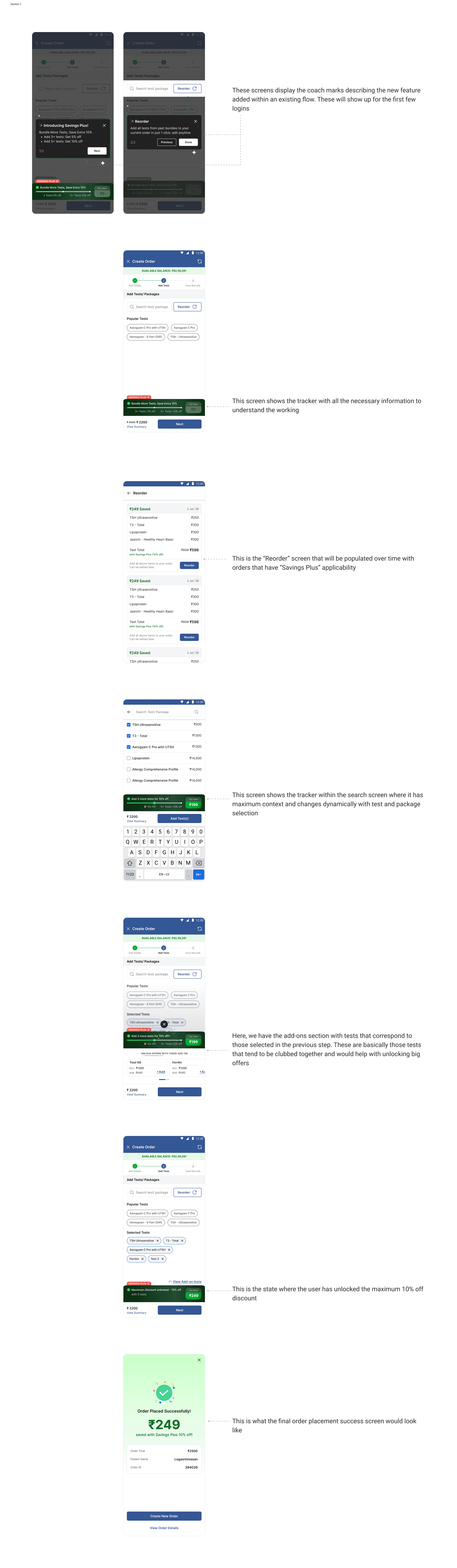
Screen 3: Closest to our final direction, but the add-ons bottom sheet covers more than half the main screen while offering zero visibility into the tests already selected, which remain hidden in the background.


04 · OUTCOME
17%
increase in AOV per order
400+
orders with "Savings Plus" per day
05 · LEARNINGS
B2B experiences do not have to be bland and boring
It's easy to default to purely functional patterns for B2B products. But we found that investing in the details, the tone, motion, visual language all helped build trust and stand out in a space that rarely prioritises experience.
Design for the staff, not just the admin
Admins configure the tool once. Staff live in it every day. Optimising only for the former misses where the real usage and the real friction happens.