

Health Trends
Tracking your health over time
Role: Core Product Designer


About Health Trends
Health Trends is a feature which brings all your lab test results together and shows how each parameter changes over time, helping you spot patterns and identify what needs attention.
The Problem Statement
-
Lab reports today, present health data as isolated snapshots, with no clear way to connect them over time.
-
This makes it difficult for users to understand how individual parameters are evolving, causing important trends, patterns, and early warning signs to go unnoticed.
-
As a result, users lack a clear, continuous view of their health and are unable to take timely, informed action.
The Target Users

Phrameasy customers: Typically tier 1
Thyrocare customers: Typically tier 2 and 3
Customers of any age group who book their lab tests either via Pharmeasy or Thyrocare directly.
The Project Goal
-
Build a unified health vault for easy access and understanding of all reports.
-
Allow families to consolidate and manage reports for multiple members under one account.
-
Drive regular testing by enabling users to track trends and take proactive action on their health.
-
Create a one-stop destination for users to understand their health and not rely on external sources to help evaluate their lab test results.
Challenges Faced & How We Overcame Them
-
The lack of a PRD as the product team only had an idea but could not visualise the potential solution.
-
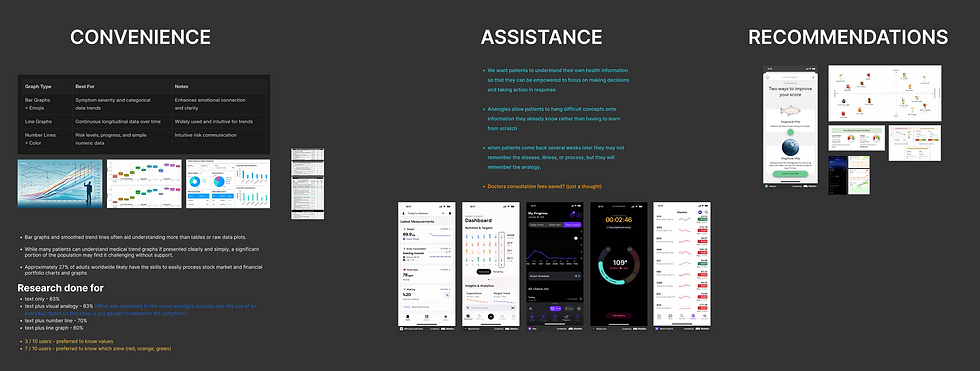
PharmEasy had previously launched a trends feature, but it failed due to excessive complexity—despite strong visuals, it overwhelmed users with too many values and high information load.
-
To reintroduce this feature effectively on the Thyrocare front, our focus was on simplifying the experience while retaining meaningful insights.
-
We studied user behaviour across domains where data-heavy interfaces are common such as fitness apps, fintech platforms, and other chart-driven productsnto understand how users interpret and interact with trends.
-
These insights helped us identify patterns in how information should be structured, prioritised, and visualised for better comprehension.
-
We then applied the “Crazy 8” design exercise to rapidly explore some super crazy design directions, and collectively settled on one solution that had both, simplicity and depth.
The Research Snippets
1. Cross-domain Study
2. Collating "How Might We" Questions

3. Crazy 8 Explorations

The Prototypes
1. Access from Order Tracking Page

2. Access from Test Report

Understanding Key Screens

The Potential Impact
-
Increased engagement with reports where more users explore trends and past data.
-
Improved understanding of health data resulting in better interpretation of patterns and changes.
-
Higher repeat testing rates by users returning more frequently for follow-ups.
-
Stronger retention and user stickiness by users consistently coming back to track their health.